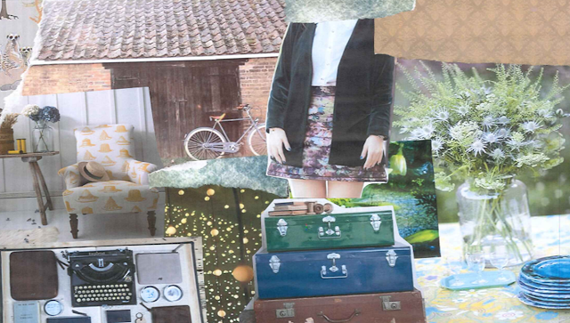
Mood Board 1- Made to look very vintage giving the idea of the style of my magazine. Props such as old fashioned trunks, casettes and things such as flowers (if not outside!) I've also includeed patterns which i would like to include somewhere in my magazine, wither as a backgrpund or as patterned text.

Mood Board 2- Clothes made to look quite edgy which could make my artist seem a bit more on trend rather than just 'folky'. The simple make up on the bottom right image would look interesting on my model and would link well to the genre of my magazine as well as the look that I am goung for which is quite natural.
Mood Board 3- This is a very vintage style showing outfits, patterns, hair styles as well as props which could be used in the photo shoot. I have also used two images of indle artist Florence Welch from band Florence and the Machine who is known for having a very indie/vintage style which is how I want my artist to look
Mood Board 4- This has been made to look very vintage as well. I like the outfits at the top of the page (tshirts with shapes cut out of the material) because it makes the photo seem relaxed and the person in the photo look relaxed as well. This is vital otherwise the reader may feel awkward looking at the pictures if the artist looks uncomfortable. I've also shown a lot of outdoor photographs which is the style I want to use.
Mood Board 5- This moodboard shows some slightly edgier styles which I think would look good on my cover. There is some black and white images which I also think would be interesting to copy and use in my magazine as it would look quite unique. I also like the hair styles on these pictures, the hair up (top left) looks quite natural which is how I want my cover star to look and I also like the flowers in the hair (bottom right) or the hat (bottom middle) as I think this would fit well with my genre.
Mood Board 6- Again these are more edgy which I like. The lace and leather aren't necessarily fitting with my genre, however I would like to use this kind of style somewhere in my magazine (this could be on another artist featured in my contents page). Most of these pictures have been taken outside which is something I would like to do.
Mood Board 7- These images show a lot of high waisted clothing which I think looks really good and I would like to use this style on my artist. I think that the style would gp quite well with the indie part of my genre. I alos like the poses they are using as it looks quite natural which is important to consider when taking pictures of my artist.
Mood Board 8- These photos are taken outside which I think looks quirky and would fit my genre really well. It would look natural which is how I want my artist to look. The vintage styles shown on the mood board also reflect how I want my artist to look.
Mood Board 9- I like the styles of the jumpers and skirts on this moodboard because i want to take images putside, however the seasons make it slightly more difficult. Having the jumper would be more fitting for the time of year. I like the lace tops and the flowing skirts that have also been shown and I would like to have this kind of style shown on my magazine. The pictures are very light/bright which is how I want my images to look as it is quite natural and would look interesting for my cover artist.
I have done mood boards to show the vintage style of my magazine. On the moodboards I have shown outfits which I think would be suitable for my artist on the cover and double page spread of my magazine. The styling will be important for this because the costume will need to reflect the image of the artist which I'm trying to convey as well as the image of the magazine. The styling will need to represent the genre (eg: indie folk artists won't dress the same as punk artists) and go with the whole view of the magazine.
Most of the imgaes used show the models wearing vintage style clothing which will influence the styling of my magazine. However, I would like my artist to have a bit of an edge which is why I have included certain images (such as women wearing leather jackets and skirts, etc). There are more vintage styled clothes and I have also used quite a few pictures of indie folk icon Florence Welch from band Florence and the machine. She wears a lot of vintage clothes and looks classy which is what I want my artist to look like.
On the mood boards there are a lot of images used showing people outside which is the idea that I want to use when photographing my artist. Photographs in outdoor areas are often used when showing indie folk artists such as Noah and the Whale and Ellie Goulding.


Brilliant moodboards. Your inspiration is clear. Hopefully you'll be able to utilise several elemnets in your work. Well done Yasmin.
ReplyDelete