Thursday 21 March 2013

Evaluation Draft: Question 7

Draft question 7

Looking back at your preliminary task, what do you feel you have learnt in the progressing from it to the full product?
  • Main: The ability to use softwear better. At the begining (my preliminary task) my photoshop skills were limited and the product I created wasn't very good. After practice and tutorials on photoshop, I managed to use a variety of different tools in order to make the product look more professional
  • Preliminary Task

Final Product
  • It is clear to see where my skills have changed and developed from start to end as the final product looks a lot more professional and more aestetically pleasing to the target audience
  • From doing my preliminaries I have also learned to use different technologies such as cameras, lighting equipment and, of course, Photoshop. Using these I increased my knowledge as to how magazines are made and also how to use skills I have gained in order to create a product that looks professional and authentic
  • On my final product I used a variety of different tools and effects which I worked out how to use which makes the product look a lot more professional in comparisson to my preliminary work
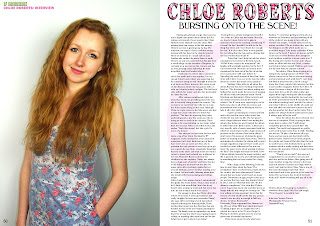
  • In comparisson to my prelim, the way I have edited the cover to make it look more professional as I have done a lot of research to realise how the magazine should look. When doing the preliminary work I hadn't done any research into magazine conventions and I belive that this has helped me to create a better product overall
  • An example of this is using exposure and contrasting in order to make the image more striking and to make the magazine stand out more to readers. Before, the colours which I used were very simple and understated meaning that it looked fairly boring. I believe that the cover of my magazine is very eye catching and is attractive to the intended audience (as opposed to my prelim which was supposed to be aimed at students who may not have been attracted to the magazine)
  • I also believe that I have have become more efficient with using the technologies, for example I am a lot quicker at completeing tasks on Photoshop and have a wider undertanding of how to use it as well as developing skills.
  • My understanding of the way which magazines are created has improved as during the research and planning I looked into magazines. This involved analysis of covers, contents pages and double page spreads. This helped me to understand the conventions of magazines and helped me to realise how I needed to layout my magazine
  • Double page spread
  • The double page spread shows using techniques such as exposure, shadows, text allignment, creating patterns within text, etc
  • I also realised the techniques, features and conventions used in order to appeal to a chosen audience. Features such as the golden spiral for photographs as it controls the readers focus on the page as well as being able to make the page aesthetcially pleasing to the target reader.
  • My knowledge grew further during planning when I was creating drawn plans and computer versions of the plan. Working out where everything would look best and what i wanted it to look like overall was challenging however with time and practice I became a lot more aware of the layout of my magazine and how i wanted to make it look. This then helped me achieve my final product
  • Contents pages

  • Showing the contents pages from my preliminary work and my final project it is clear to see the differences as I have developed my skills on photoshop
  • First of all I believe that the final contents page is more suited to my target audience as I think that they will relate more to the images, text and layout/overall look of the page
  • i think that my preliminary work is quite boring and does not relate well to the target audience of school students as they will be more likely to want to look at something exciting and fun (full of pictures, text, stories, etc) and therefore doesnt fit the target audience well
  • Also the layout looks more professional. The final design shows that I have researched carefully into the way which magazine contents pages have been layed out in real magazines. I did this in order to achieve an authentic looking magazine contents page and I feel that with a few tweaks it could look very professional and authentic
  • The preliminary layout wasn't unprofessional or scatty, it was neat which was good as it was clear for the audience to read however the neatness made it look really boring and therefore not good enough to be considered a real magazine
  • I have learnt that using images of better quality (and using the right people!) ensure a more professional and genuine look to the magazine. Using the camera and other equipment that the school provided I managed to create good quality images to use throughout my magazine in order to ensure that the magazine looked as good, high end and professional as possible
From looking at the cover of my magazines, development in skills and ideas is clearly shown. The more professional (neater) layout and the more relevant topics shows development in my understanding of the concept and target audience as well as developing skills in taking photographs and using technology (Photoshop) in order to bring my product together and have continuity throughout

Evaluation Draft: Question 6

Draft question 6

What have you leart about technologies from the process of constructing this product?

Laptop/computer:
I used the computers at school which were available to me during lesson time which helped me to construct my project. The school computers provided all of the softwear (photoshop) which I needed in prder to create my project. I used my Toshiba laptop at home to do the majority of the reasearch I needed before hand in order to gain an idea of what I needed to do to make my project how I wanted it to be.

Adobe photoshop:
I used this to begin constructing my porject by adding photos, text an effects. this softwear enabled me to make my project as professional as possible. After quickly learning how to use it on the preliminary tasks, I became able to use the softwear to make the product look how I wanted it to.

Camera:
The camera which I used was a school camera and was fairly good quality. The images I took using it were taken against a white background and make the content of the image look really good. A comment from my draft product was that the quality of my images needed to be better and I feel that using the camera provided me with better quality images which made the overall look of my product professional
I also used a smaller camera to take the image of a seperate musician on my contents page as the previous ca,era was unavailable which took images with slightly less quality. However I think that the image has still turned out quite well and doesn't make the page look less professional.

Lighting equipment:
I used stand lighting equipment when taking photographs to make the images have a softer look. This also made for the quality of the images to be better as they werent very dark and made the artist look really good which added to the overall quality of my work.

Dropbox:
I used this to make usre I had all the files which I needed available to me at any time. This meant that I could use different computers everywhere and was able to have all of the necessary work with me. This was especially useful during the draft product as I kept saving the work to dropbox and then would finish/improve the work at home.

Animoto:
I used this when creating my magazine pitch to the class. By uploading images and text I could show the class what I wanted my magazine and what I wanted to achieve as well as showing how I would achieve it. Being able to add music to the background gave a greated indication as to the genre which I wanted and made the overall pitch more effective.

Scanner:
Because I chose to do my moodboards by hand (gluing and sticking) it meant that I needed to use the school scanner to send the images to my email so that I could upload them to my blog. An easier way would to have taken photographs which would then have been upkoaded however I thought that this way would make the image quality better. This got the point across of how I wanted my magazine to look and the quality provided by the scanner made it clear. This also helped my when I had drawn plans of how I wnated my magazine to look on paper and scanned it into the computer to post onto my blog.

Internet:
This was a vital piece of technology that I used in the construction of my product as I needed to reasearch a lot of things when doing my research and planning. Examples of this includes things such as covers, contents and DPS on google images for me to analyse so I could realise the conventions of real magazines and apply them to my magazine as well as researching facts about magazine publishers and artists. I also used hotmail emailing as a way of transferring information around with me so I could do work anywhere. Google chrome also made it easier to use Blogger so I could display all of my research, product and final evaluation (when it is complete).

Microsoft word:
I used this to write my magazine article with my artist as I could do a word count to see how much i had done/needed to be done as well as minimising the risk of having any spelling mistakes to make it as professional as possible.


Evaluation Draft: Question 5

Draft question 5
How did you attract/addrsss your audience?
  • The audience which I chose for my magazine was older teenagers and you adults; preferrably srudents as I think that these are the people who would be most interested in my genre and would relate to my magazine the most. Because of this I have designed my magazine in order to attract them to buy it
  • I originally chose a male and female audience however the bright colours such as pink and green which stereotypically is more appealing to females rather than males, it would suggest that it appeals to a mainly femal audience.
  • I used a female cover star who was a similar age to the target readers which I felt would make the readers more able to relate to the magazine and would also be appealing to a female market, however using a girl could also appeal to males which would suggest a mixed market
  • Although the colours aren't typically masculine, i feel that they would be aesthetically pleasing to both genders as it is a magazine representing a style of music and i think that the colours reflect the genre. The genre which I chose would be appealing to both genders as indie/folk is popular amoungst males and females which is why I think that my magazine would be suited to a mixed market
  • I think it would be aesthetically pleasing to both males and females because the photograph of the girl who I used is very attractive (males) as well as being relatable (females) due to the age. She looks stylish and reflects the genre well which would make it attractive to fans of the genre which I have chosen
  • The female name is displayed in a pink flowery font which would be more appealing to women rather than men however the vintage folky style that I wanted reflects the genre and so I don't think that males would necessairly be put off from buying the magazine because of this
  • The names of the featuring artists on the left hand side are predominantly male and/or bands which feature mainly male members. This shows that the magazine is not just targeted at females. The artists featured are also artists for the particular genre which would be something to attract fans of the genre to buy if they knew that my magazine will feature these artists and would buy the magzine
  • I have chosen to use British artists as I think that this would relate more to my target audience and would attract them to my magazine. This could be due to the fact that they are more likely to be performing at British festivals/on tour and so the reader will have more of a chance to see them perform over artists of other nationalities. I also think that British music has more of a folk sound as opposed to other kinds which is why I have included these artists
  • I think that using the strap line 'THE INDIE AND FOLK MAGAZINE' would make the reader more aware of the genre which I have chosen and would then make the magazine seem more attractve to the young target audience
  • I have designed my contents page for my audience as I think that the short, snappy descriptions would appeal to them as reading ling boring sentences would make them lose interest in the magazine. I think because they would be fairly young writing in the way that they would speak makes it more relatable to the reader as well as the feature
  • I think that the photographs that I have used on my contents page would also relate to the reader as both of the artists that I have included are quite young. I chose to include a male musician as I though that this could make the readers (particularly males) feel as though the magazine was aimed at both sexes. Also, from reasearch that I did of the genre I found that the musicians in that catagory were predominantly male and I wanted my magazine to be authentic whih is the reason for the male star
  • Using young artists who are suppoosedly successful would relate to the younger readers as they would probably be at university and would therefore want to be successful which could make the artists more relatable
  • Giving my readers and insight into well known artists lives would make it relatable as they would feel as if they have a greater knowledge of music which they are fond of. For example, "new artists uncovered by IF" would make the readers feel as if the magazine are sharing information with them
  • Giving the reader the opportunity to find out about artists that they are interested would be appealing as it is something that they like and would make them more inclined to read the magazine
  • Adding a twitter @ name is relatable to the target readers of my magazine as they would be younger. A lot of younger people are on social networking sites now and so this would be of interest to them. They could follow the twitter account and find more information about the genre in general and would make them have more of an interest in my magazine. This would also increadse knowledge of the magazine as people may come across the account online and then go and buy the magazine
  • I think that the way I presented the interview on my double page spread would appeal to my audience because rather than using a question and answer interview, I made it into flowing paragraphs which (in my opinion) look better and makes the interview seem to be more of a feature. I think that this would make the reader feel as though it was more of an upmarket product
  • The language which I used is formal but is done in a way to make the reader feel relaxed when they are reading it. I think that this will be appealing to the young adults i targeted my magazine at because when they are reading it they will feel as though they are reading a proper publication as opposed to something that has been designed for teenagers
  • I think that the photograph on the double page spread looks very relaxed and so will appeal to readers as they will not feel awkward when looking at it. Feedback from peers on my first draft said that the pose and facial expression needed to look more relaxed and I think that the image works well
  • The colours which I have used are all very similar as they are all shades of pink and purple. I think this reflects the soft nature of folk music as well as being fun for my target audience to look at and therefore will be appealing and attractive to my audience. The almost transparet letter 'C' in the centre of the article page also makes the double page spread fun to look at and read which my readers will find attractive
  • The cover line 'BURSTING ONTO THE SCENE' suggests to my audiece that Chloe is an upcomming/new artist which they will find interesting as they have an interest in new music which will be a bigger inscentive to buy the magazine. therefore the idea of a new musician being interviewed will be attractive to them when looking at the magazine and reading the interview
  • Because the artist is new to the music industry, my readers will feel as though they have a connection with the artist as they both have an interest in music. This is then continued due to the fact that the interview is mainly based on music

Overall I feel that my magazine attracts and addresses my audience well as I have focused a lot on my audience profiles and what they need. I have also concentrated on music a lot which links in with the subject of the magazine as well as the readers interests. I think that using the correct artist adds to the attracton to my readers as they will want to know about her and will have things in common with her. I think that she fits the genre of the magazine and therefore appeals to fans of the genre.  


Wednesday 20 March 2013

Evaluation Draft: Question 4

Draft question 4
Who would be your intended audience for your magazine?
Girl

  • This is 19 year old student media student Alice Williams, a hipster who is interested in music, magazines and fashion
  • She spends a lot of her time on the internet; either on social networking sites such as twitter, or browsing on whop websites or eBay
  • She loves a bargain and enjoys mooching around the vintage shops which she can find in the city centre
  • Being a media student it is fair to say that she is interested in magazines, whether that be music, fashion or film. She took media at A level and excelled herself. She wants to be a journalist, preferrably in fashion because it is one of her passions
  • She spends her spare time doing photography but her iPod is alway near by- it is like her bible. She is never without it and that is a fact.
  • She is interested in alternative artists, The XX being her favourite at the moment with Jake Bugg not being far behind. She loves finding out about new or relatively unknown musicians which is why she can often be found at the local O2 Academy supporting upcoming artists
  • Her iPod holds around 4000 songs and it depends on her mood as to what she is listening to
  • She has recently taken an interest in folk music and has her ticket for this years C-Fab festival where she will see musicians such as Leafblade and she is more than excited to go to this years Leeds festival
  • Being a keen shopper and music lover, all of her spare money goes onto CDs, downloads and clothes! Topshop and vintage shops are her favourite as she likes finding something different so she stands out from the crowd
I think that Alice would be the target reader for my magazine as she is interested in the genres of music which I have chosen to base my product on. She likes folk and indie showing that the magazine would be perfect for her and is also going to some festivals in 2013 and would love the festival update feature that I have included in my magazine. She also likes vintage and so my cover stars style would appeal to her. Insode I have also included Florence Welch's style secrets which would be appealing to Alice as she likes fashion (vintage) and music- this could mean that Florence would be one of her inspirations (as she is widely associated with both of these things) and would give her a bigger inscentive to buy the magazine.

Boy


  • Josh is 18 and is in his gap year working in a music store to save money for his university course in product design. He DJs on weekends for extra cash but enjoys going out and socialising and loves being a trendy
  • He likes going to gigs and has a huge interest in music, he has an iPhone which holds so many songs hes lost count. Finding new artists is his passion and he loves going to small gigs and explore new musicians in the industry
  • Has been waiting for Glastonbury 2013 since the end of the last one. Got his ticket and is going with his mates- the same mates who he goes skate boarding with at weekends
  • Interested in fashion, a percentage of his weekly earning goes towards his tshirt addiction. He can often be found wondering around Burtons and Topman looking for the new arrivals. Friends would say he always has to be upto date- he would agree
  • Loves his technology, laptop, iPhone, iPad, iPod, you name it, hes got it
  • He loves his Ford KA, gives him independence to do what he likes when he likes. Fuel costs are a pain in the neck though
I think that Josh would be the target reader for my magazine as he is really interested in upcomming musicians and new music which is what my magazine is about. The sections on fashion would also be interesting to him and would make him more inclined to buy the magazine. He likes going to gigs and festivals and so the festical guides would appeal to him. The article on upcomming musician Tom Fox will be appealing to him as he likes new music and he would be able to relate to the male in the magazine. Music is his passion as he is doing it at university and so i would say that he is the ideal person to read my magazine.

Evaluation Draft: Question 3

Draft Question 3
3. What kind of media institution might distribute your media product and why?

I need to make my magazine available to the general public and for that I need to find a publisher to create my magazine and make it available. Publishing includes printing, binding and distributing.


I want my magazine to have a binder as I think that it makes it seem like more of a luxury, branded product. I think that it makes the product look more professional as well as more luxurious.

My magazines info for funding:
Niche- It is an idie folk magazine. Not a lot of these genre music magazines exist and so therefore there is a gap in the market for my magazine. Indie folk is a genre that is becoming increasingly popular and will therefore
Market research and competition- there are a lot of music magazines which are available at around the same price as I would be charging however there are very few in the UK that target fans of the indie folk genre.
Start up- The magazine will need intial start up funding however I believe that it will be popular and the price of £3.00 per issue this will (when it has been set up and is in full flow) pay for the publishing of it itself


IPC Meida
  • IPC media is a publishing company and does all of the things which I need to happen in order to make my product available to the public as well as making it an overall success
  • IPC media has a lot of experience with publishing magazines and newspapers such as THE SUN and NME magazine which have both been successful. NME has been selling for over 60 years and I think that my magazine could be successful like this
  • The company also has a good relationship with a large part of the population (selling over 350 million publications each year) meaning that people who are interested in magazines (such as hipsters and trendies- the social groups which my magazine is targeted at) will recognise the name IPC and will therefore have a greater inscentive to purchase my magazine 
  • There are very few indie folk magazines on sale in the UK  and the genre is becoming increasingly popular. Due to the rise in interest I believe that there is an opportunity IPC to sell my magazine and for it to be a success
 Magazine Distribution
  • In shops- WHSmith, music shops, etc. This allows people who are interested in music and magazines (hipsters and trendies) to have access to my product. This would then mean that they would see my magazine and buy it making it successful
  • Postage to people who subscribe to my magazine, meaning that they automatically purchase my magazine monthly which guarantees readers and money for my product. This would mean that IPC would have success when selling my product
  • My magazine, if published by IPC, could have an online issue/website like NME does which would make the magazine more apealing to teenagers as they use computers/technology regularly and would also ensure the magazines popularity. This would allow a larger part of the population would have knowledge of my magazine
  • Magazines which are distributed in the same way include;
  • In shops: LOADS! Q is sold in shops, Dazed and Confused, ID, mojo. The list goes on. This way is proved to be successful
  • Online: Magazines such as NME and The Fly which have large viewing figures proving that this way of showing the magazine to the intended audience is successful
  • Subscribe: A lot of fashion magazines such as Elle and Vogue are all available for subscription which makes the publishers a guaranteed amount of money for the magazine issue before it has even been written/planned/published 
 Price
  • I would have a set price for my magazine of three pounds which would make they type of circulatuion that I have chosen to be 'paid'. If i decided to make it a free magazine then the target readers of my magazine will see it as a product freely available to everyone rather than a luxury item. Giving it the status of a luxury item would make the hipsters and trendies that I am targeting at more inclined to buy my magazine
  • The set price could be reduced if a person was to subscribe to the magazine for a long while as it would make them feel as though they have gained something and would make them not want to unsubscribe.

Evaluation Draft: Question 2

Draft Question 2

How does your media product represent particular social groups?
  • Hipsters and trendies
  • Both heavily interested in magazines, internet and radio
  • The kind of people that will be interested in these things and because of this I will be representing this group
  • Also the social group that will be represented will be people who are interested in the music genres which I have based my magazine on: indie and folk music
  • This social group has been represented by putting the names of the bands that they like down the left had side of the magazine cover
  • Also to represent the folk group in my magazine I have used my artist and the identity that I have given her to show the represent the genre to the readers. She plays guitar which is something folk music is known for as well as indie music. doing this is one way which I represented the social group
  • The costume that Chloe, my artist, is wearing represents the indie/folk genre well. I wanted to use a vintage style which is why the costumes used are very floral. From my reaearch and planning stages I knew that I wanted her to have a vintage style which I feel reflects the genre well

This media consumption file for hipsters from UK TRIBES shows that they are very interested in magazines which is good for my product as it is a magazine. A music enthusiast would be interested in music magazines (my product) and radio- both of which hipsters are interested in. They are also interested in the internet which would suggest they enjoy social networking such as facebook and twitter which is why i have included the magazines twitter information on the contents page and the magazine article writers twitter information. This would also suggest that they download a lot of music over iTunes rather than buying albums which is why i have included my artists album release date rather than saying 'album in stores...' as this would appeal to them more.


Artist Comparisson

Ellie Goulding/Chloe Roberts


Similarities:
  • The makeup that has been used on both of the female artists is very natural looking which reflects the 'free spirited' relaxed music genre. Folk is quite an earthy type of music and I think that the natural make up suits the genre and makes my artist look authentic. Ellie has nude coloured lips whereas Chloe has pink. I chose this because I think that the pink contrasts well with her hair colour.
  • The pose used by both girls includes having their hand near their face wither holding their hair or the jacket. I thought that the image of Chlow was quite striking which is why I used it as a cover shot and and I also think that the image of Ellie is striking which makes my artist look genuine. The confidence exerted by Ellie shows that she is a famous artist and I believe that Chloe shows a similar level of confidence which makes her status as a famous musician more believable.
  • Both of the artists are wearing a pale blue denim jacket. I liked the costume which Ellie was wearing as I thought that it linked in well with the indie folk genre and I wanted to portray Chloe in the same way.

Differences:
  • The two images show the artists hair being different. Ellies looks much more professionally done and is ver made up where as Chloe is more natural. I chose to do this because I thought that her having a more natural hair style would reflect the earth sounds and image assoicated with folk music.
  • Also Ellie is pictured against a black background whereas Chloe is against a white background. Although these shots will have both been taken in a studio, I chose to go with a more natural tone as a background which, again, I thought reflected the genre of music well.
  • Ellie is wearing quite big chunky jewellery whereas Chloe isn't. I wanted Chloe to look subtle and I think that if she was wearing a lot of jewellery it would have taken attention away from her face/hair which waas something I didn't want to happen.

Artist Comparisson

Florence Welch/Chloe Roberts


Similarities:
  • Both of the images have been taken on a white background. Although this is similar, the reasns that this has been done could be different. I chose to do this because it will make the image a lot softer which represents the genre. The image of florence has been taken on a white background because it makes her stand out more and makes the image more striking to look at
  • Both of the artists have been styled to wear a black and white dress. The butterfly dress that Chloe is wearing looks very vintage which is the style that I was going for as it is what I have wanted since the research and planning section of my coursework. Florence is wearing a black and white patterned dress which makes the image stand out a lot and makes her look very striking
  • They both have naturally red hair which I think makes them similar. The look that I ewas going for was vintage and Florences style (not in this image) is normally quite vintage
  • They both have a subtle ring on their left hand which sugeests contuniuty within the music genre

Differences:
  • Florence looks professionally madeup in comparisson to Chloe due to the 'perfect' skin and bright red lipstick. Also her hair is very sleek and glossy whereas Chloes hair and makeup is very natural and free. I have done this because it reflects the music genre which I used in my magazine whereas Florence has been made to look more striking rather than natural
  • Florences hair is a lot more red than Chloe which has been done to make her stand out more and give her more of a character/identity. Chloes hair has not been enhanced and I feel as though this makes her look more folk than indie and I believe that florence looks more indie than folk.

Overall I think that my artists represents the genre very well. Her hair and make up is natural which reflects the folk element of the music. I think that the styling aslo looks genuine and the cover pose (shown on the comparisson with indie folk artist Ellie Goulding) shows her having confidence which makes her look as though she is a credible musician.


Monday 18 March 2013

Evaluation Draft: Question 1


Draft question 1

In what way does your media product use, develop or challenge forms and conventions of real media?

Research and Planning

·         Looked at magazines which are of a similar genre to my indie and folk genre (such as The Fly and 1883 magazine) to see how they have been laid out to get inspiration of how my magazine should look
·         Looked at real examples of magazines and past students work to see the conventions of proper magazines (make mine look as professional as possible). Most successful student work follow conventions of magazines and look as though they fit in on the shelves of shops
·         THE CONVENTIONS:
-Cover star fitting the genre and how to represent them (costume, hair, makeup,
pose, facial expressions, etc) To do this, looking at some magazines which
feature a star of the genre which I have chosen to see how they are presented
through the style of clothing, hair, makeup, etc.
-Where the eye is drawn to on the page/where to place the most important things
on the page
-Mastheads in certain areas of the page- across the top on the left side of the
page in large fonts to gain attention from the reader. Fonts all need to link
throughout the magazine to give continuity and make it look as a whole product
·         Found out that some magazines do not follow common conventions of magazines (list examples) and how it is effective. How the different look of the magazine will represent/reflect the genre of music and attract the target audience of the magazine.

Designing and Making

·         Took some magazine conventions into consideration when designing the magazine. For example, taking inspiration from the magazines which I looked at and put the masthead at the top of the page on the left
·         The cover star I chose fit the genre of music which my magazine represented. Why?? ‘Free’ looking style, natural hair and makeup, clothing very floral which relates to the vintage/folk style that I wanted to show
·         Placement of important things on the page in good sizes and eye catching (or not) fonts to show the most important things on the page
·         How does the name of the magazine reflect the genre and relate to the target audience? IF (indie folk- the two genres which I chose). The colour of the title in a light colour to reflect the ‘soft’ sound of folk music. Large to catch attention- make a statement in the shop
·         The layout of my cover, contents and double page spreads try to be simple so that the reader can clearly read all of the information on the page. The cover uses a large title in a bright colour which makes sure it is seen easily and the rest of the writing on the page has been put in a large font which is easy to read and also in bold colours making it stand out. The contents uses the title ‘contents’ at the top of the page with two images displayed down the left side. On the right hand side there is a column with page numbers and what the pages include along with a short description of what the page is about. I tried to make it short and snappy like many magazines because the reader may lose attention if they have to read full sentences. The double page spread follows the conventions of many magazines as it has an image of my artist on one page and on the opposite page the artist name at the top. Then a short snappy sentence explaining what the article will be about and three columns of writing
·         Photographs: important part of the magazine. The model needed to look realistic and as though they fitted the genre. This is why the costume my model was wearing represented the folk genre and the hair and makeup styling looked natural. I wanted to take photographs in an outdoor area as images of indie/folk artists often show them being in a less strict setting such outdoors rather than in a studio, however doing it outside in February wouldn’t necessarily guarantee the good weather and so taking them in a studio was a safer bet. After doing this, I thought that doing this made the magazine look more professional overall. I took a lot of photos so that I could choose the best ones to use in my magazine. I followed magazine conventions by making sure my model Chloe was looking directly at the camera as this meant that she would have more of a connection to the reader when they looked at the magazine
·         I didn’t choose a conventional colour scheme such as black, white and red because I didn’t think that the colour scheme would work well with the images which I chose and wouldn’t reflect my music genre very well. I chose


My Product

·         Some parts of my magazine follow magazine conventions
·         On the cover, the image I used followed the golden spiral rule as the place where the eye is immediately drawn to is Chloes face. I deliberately chose this image of Chloe because the close up of her face and her pose is quite striking. The eye is then drawn to the magazine title which is really large in the top left corner and then down towards the bottom where the reader can see the feature artists name and the rest of the band/artists names  
·         Listing the magazine features on the contents page follows the conventions of magazines such as Q and Esquire. I decided to do it this was because I think that it makes it clear to read and looks simple yet effective to the reader. I also wanted to use images of the cover star on the contents to show them to be an important part of the issue of the magazine and an image of another artist to show that more than one musician is used in the magazine. In all music magazines they do not just have one artist in the magazine; they have a variety and have just one as the star. I wanted to follow this convention which is why I have used two images of different musicians
·         I have given my artist an identity shown through the font used within her name which is important as it has to link with the conventions of real music magazines, all of which use real artists who have a personality. This personality is also shown through the article on the double page spread when I mention her characteristics
·         Following conventions of more recent issues of magazines I have added a twitter address for readers to follow so that they can get latest updates and information about the magazine. This links well to my target reader as they would be teenagers and young adults who are all social networkers meaning this aspect of the magazine will appeal to them
·         Using an image on one of the pages on my double page spread follows the conventions of many magazines as this is how they display photographs on double page spreads. In ‘The Fly’ magazine, an interview with Flying Lotus, the image of the artist has been placed on the left hand side of the page which is how I displayed my image. I also had the masthead, which was the artists name, at the top of the page and a stand first ‘bursting onto the scene’ to set the tone of the article and let the reader know what the article is about. I have chosen to do the article in paragraphs rather than Q&A as I was following the conventions of high end magazine Elle which presents interviews in this way
·         I have displayed the article in three columns which makes it easy for the reader as well as making the page look neat and tidy. The use of black text on a white background adds to the professional look that I was going for. I have used fonts which are easy to read which adds to the neatness of the page and the continuity of fonts throughout the magazine make the product seem more professional


Evalutaion Questions

Evaluation Questions


1. In what ways does your media product use, develop or challenge forms and conventions of real
    media products?

2. How does your media product represent particular social groups?

3. What kind of media institution might distribute your media product and why?

4. Who would be the audience for your media product?

5. How did you attract/address your audience?

6. What have you learnt about technologies from the process of constructing this product?

7. Looking back at your preliminary task, what do you feel you have learnt in the progression from it
    to the full product?

Evaluation Mark Scheme

  Level 3 (12-15 marks)

  • Proficient skill in the use of digital technology or ICT in the evaluation.
  • Proficient understanding of issues around audience, institution, technology, representation, forms and conventions in relation to production.
  • Proficient ability to refer to the choices made and outcomes.
  • Proficient understanding of their development from preliminary to full task.
  • Proficient ability to communicate.  


Level 4 (16–20 marks )
 
  • Excellent skill in the use of appropriate digital technology or ICT in the evaluation.
  • Excellent understanding of issues around audience, institution, technology, representation, forms and conventions in relation to production.
  • Excellent ability to refer to the choices made and outcomes.
  • Excellent understanding of their development from preliminary to full task.
  • Excellent ability to communicate

Friday 15 March 2013

Final Product: IF Magazine


Cover


Contents


Double Page Spread

Photoshop Work: Progress

Cover


This is the improved cover
I have changes the size of the image to reduce the amount of white space in order to make it seem more professional and doesn't immediately draw the readers attention to the white space as opposed to the other information
I have changed the font of the artists names to make it seem as though they are important rather than looking boring as I feel it did in the other font I used previously
I also changed the colour and the font on the strap line "THE INDIE AND FOLK MAGAZINE' to make it stand out more on the page as well as to fill the white space. I have added shadow effect to the strap line as well which also makes it stand out more

Tuesday 12 March 2013

Photoshop Work: Progress

Double Page Spread


I have now added the line 'BURSTING ONTO THE SCENE' underneath the artists name (which was the same line that I used on the cover) to make the article sound exciting. This has also been done in the same font used on the cover and the contents on the date/issue number

Photoshop Work: Progress

Double Page Spread


I have now changed the font to make it patterned. This adds continuity throughout the magazine and can be seen as the artists own branding which is important as being featured in the magazine gives the artist the opportunity to promote their work as well as building a bigger brand for themselves and widening their fan base

Photoshop Work: Progress

Double Page Sread


This is my double page spread. Unlike the cover and the contents page, I have made sure that the size of my page is A3 and that it is landscape. This is so the pages fit into the magazine as when it is folded it will be the same size as the A4 cover and contents pages
I have made the image go on the left hand side of the page and have made it completely fill the page. I tried to get it to fold exactly in the middle of the page as I feel this is more professional
The image that I have used reflects the genre which I have chosen well and I have played with the exposure, brightnedd and contrast in order to make the image look as professional as possible
I have added the artists name at the top of the page and made sure that it fills the page. This ensures that when flicking through the magazine, the reader will see it and be more likely to read the article. This shows her to be more of a feature and makes the article seem important

Monday 11 March 2013

Photoshop Work: Progress

Contents


Fromthis you can see that I have added information about all of the headings and added all of the page numbers to make it look more like a real magazine contents page
On the image of artist 'Tom Fox' I have changed the orientation of the text as well as adding the word 'exclusive' and the page number to make him seem to be more of a feature to the reader
I have lined up all of the text so that it makes the page as a whole look more professional

Photoshop Work: Progress

Contents


Here you can see that I have added some features and page numbers beneath the headings to tell the readers what the magazine includes. I have done it in the same font as the headings, however I think this needs to be improved as it makes the headings look less important. This needs to change as the headings need to look important

Friday 8 March 2013

Photoshop Work: Progress

Contents


Here I have shown where my text which will explain the features, regulars and extras will go

Photoshop Work: Progress

Contents


I have now included a similar patterned font for my other musician and placed it on top of the timage in order to give him an identity as well as showing the reader who he is
On my image of Chloe I have added the word 'exclusive' and have also added page numbers
As well as this I have added the heading of the things I am going to include on the contents page in the same font as the artists names on the cover. This, again, adds continuity. I also think it looks quite cool and reflects the genre choice which will appeal to my target audience

Photoshop Work: Progress

Contents


The progression from the previous content page image shows that I have added a twitter address at the bottom of the page as I feel that this would appeal to my reader as they are often on social networking sites and is therefore something which they are interested in
I have also added my cover stars name in the patterned font which I used on the cover on top of the image. I did this as I wanted her to seem to be more of a feature and the pattern also shows continuity throughout the project

Thursday 7 March 2013

Photoshop Work: Progress

Contents


This is my contents page. I have added the word 'CONTENTS' at the top of the page in the same font and colour as I believe that this adds continuity from my cover to my contents page
I have also added the strap line, issue number and month at the top of the page in order to create continuity to the reader. After researching into other real magazines I found that they include the issue number/date/etc on the contents page as well as the cover and I wanted to follow this convention
I have also included an image of my artist at the top in order to make her seem more of a feature and have included another image of a different artist below. This shows that I have included more than one feature. I made sure that my cover artist image was at the top and was bigger as this proved that she was more important

Photoshop Work: Progress

Cover


This is the same cover only I have added a strap line at the top of the page as I needed to fill some white space 

Photoshop Work: Progress

Cover
 
 
This is what the cover of my magazine looks like now. I have made a lot of changes in order to make it look better overall and more aesthetically pleasing to my target audience.
I decided to change the image as i felt that this image was more striking and would stand out to the reader when on a shelf in a shop which would give them more of an inscentive to buy the product.
I have also changed the colour of the magazine name 'IF' to a softer, paler green as I thought that it represented the soft sounds of folk music better and added the word 'magazine' beneath to make the title as a whole look more complete
As well as this I have added band names down the side of the page which will tell the reader who is in the magazine in order to make them want to buy the magazine as they are names of artists that they are interested in
adding a barcode, date and issue number add the the conventions of normal magazines and make my product look more genuine


Monday 4 March 2013

Photoshop Work: Progress

Cover


This is me using Photoshop- softwear on the computer that will enable me to create a professional product that will appeal to my target market. Currently just testing different shots and different fonts/colours that I will use on my cover.
So far I have placed an image from my documents and cut around the edges (not very well as her free hair is really whispy which is what I wanted but also a pain to cut around!) of the picture. I have then added large, blocky text and written 'IF' which is the magazines name in order to make it stand out. The blocky text makes it stand out on the page and the bright green is very striking.
This is a work in progress and I am unsure as to whether I like this cover or not...

Photoshoot: Chloe

DSCF3494DSCF3491DSCF3490DSCF3487DSCF3485DSCF3474
DSCF3471DSCF3470DSCF3468DSCF3464DSCF3461DSCF3460
DSCF3458DSCF3454DSCF3453DSCF3452DSCF3451DSCF3450
DSCF3448DSCF3441DSCF3437DSCF3434DSCF3428DSCF3426
yasmin francis' photostream on Flickr.

I re took my photos in order to make the magazine look more professional.
This is a selection of the photos